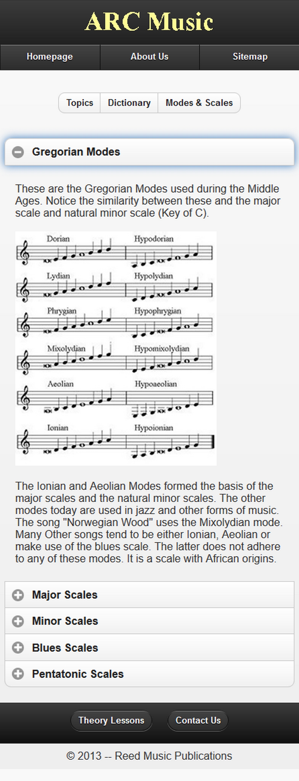
This is a jQuery Mobile site of a desktop site I originally created in 2012. The Click Stream and Storyboard for the site show the data relationships between all the pages. I made use of a basic jQuery color scheme and ensured that the navigation was as planned. Some reorganization of the site's content/information, however, could have been implemented, to improve usability; it deals with a lot of information. This site was created at BCIT.
The site could have benefitted from more use of color. It is too late to change it now, but at the time, it seemed correct. It isn't. At times, legibility can be effected -- and it is no different here. There is too much information on the homepage and the images could have been of better quality.